 Starting on Tuesday, April 21, 2015, Google will release a massive algorithm update that will change the way it ranks websites in search results. Just how massive will this be? According to Google's Webmaster Trends analyst Zineb Ait Bahajji, this may impact search rankings greater than both the Panda and Penguin updates.
The change comes down to one very important criterion: whether your website is fully optimized for mobile.
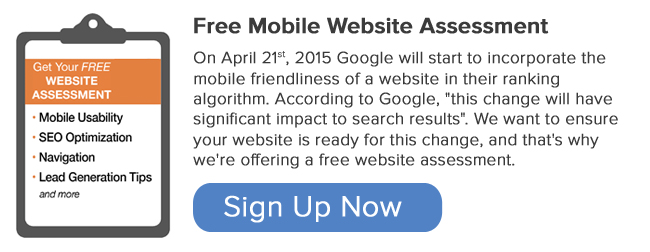
Are you ready for it? Why not find out? Request a FREE Mobile Website Assessment here.
Google announced the change on their Webmaster Central Blog in early February and has since continued to release details to help better prepare marketers and website owners to predict how the update may affect their site and search traffic as a result. They explain:
"Starting April 21, we will be expanding our use of mobile-friendliness as a ranking signal. This change will affect mobile searches in all languages worldwide and will have a significant impact in our search results. Consequently, users will find it easier to get relevant, high quality search results that are optimized for their devices."
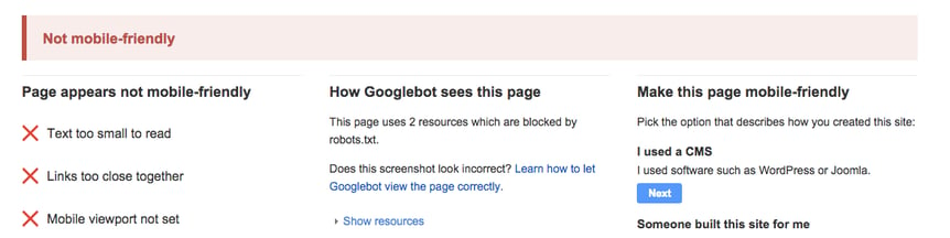
If your website isn't fully optimized for mobile browsing, you will likely see a hit to your ranking on mobile searches. For this reason, some people have dubbed this update "Mobilegeddon." To determine you're mobile readiness, you'll want to dig into Google's assessment tool here.
Choosing Your Mobile Optimization Approach
If any of your webiste content isn't optimized for mobile, it's really important that you make some changes in light of the Google Algorithm update. Even the best, most appealing site pages will see diminishing returns after April 21st if it's not optimized for mobile.
When optimizing your website, you have options. Google recognizes three different configurations as "mobile-friendly." You'll have to move your site content to one of the following set-ups to protect yourself from the change. Let's dig in!
1. Responsive Design
Responsive Design is Google's #1 recommended design pattern. The reason this option is so desireable is because responsive design doesn't create two copies of the same website. Users only need to visit one URL and the website will adapt to the device they are viewing it from automatically.
2. Dynamic Serving
Similar to responsive design, a dynamic serving approach keeps the same URL -- only this time, the HTML actually changes. Dynamic serving uses user-agents to "sniff" out what kind of device the viewer is using and then dynamically serves up the appropriate view.
Although it is an acceptable solution, Google notes that this user-agent detection can be an error-prone technique.
3. Mobile Website
Creating a separate mobile website is actually one of the earliest implementations of mobile optimization, and it will still pass Google's requirements. When a user arrives at your website, this set-up tries to detect the user's device, then redirects to the appropriate website using redirects.
Why is Responsive Design the best choice?
Right Idea Media & Creative uses responsive design, so our bias is clear. However, there are lots of reasons this options makes sense as the best way to optimize your website right now.
Website Visitors like it.
From a user's perspective, navigating a responsive website it pretty seamless. It use the same URL and site content throughout and easily adapts to every device making it a consistent experience.
Google likes it.
From Google's stand-point, there are a few reasons that make responsive design their first choice. First and foremost, it saves resources when the Googlebot crawls your site. Rather than having to crawl multiple sites, the Googlebot can go to one places which increases efficiency and helps Google index more content.
Marketers and Website Owners like it.
A responsive site requires less time to maintain because there won't be multiple pages housing the same content. It also requires no redirection of users based on the URLs for their various devices, which speeds up the load time of your website. What's more -- faster websites lead to more conversions.